Design Media was the first design class after all my foundational general art courses. My professor gave us a list of renowned designers to research and get a feel for their distinct styles. The designer that stood out to me the most was Victor Moscoso. His style is psychedelic and the colors are meant to stand out and vibrate as if they were alive. I chose his style to create a poster to match a current news headline
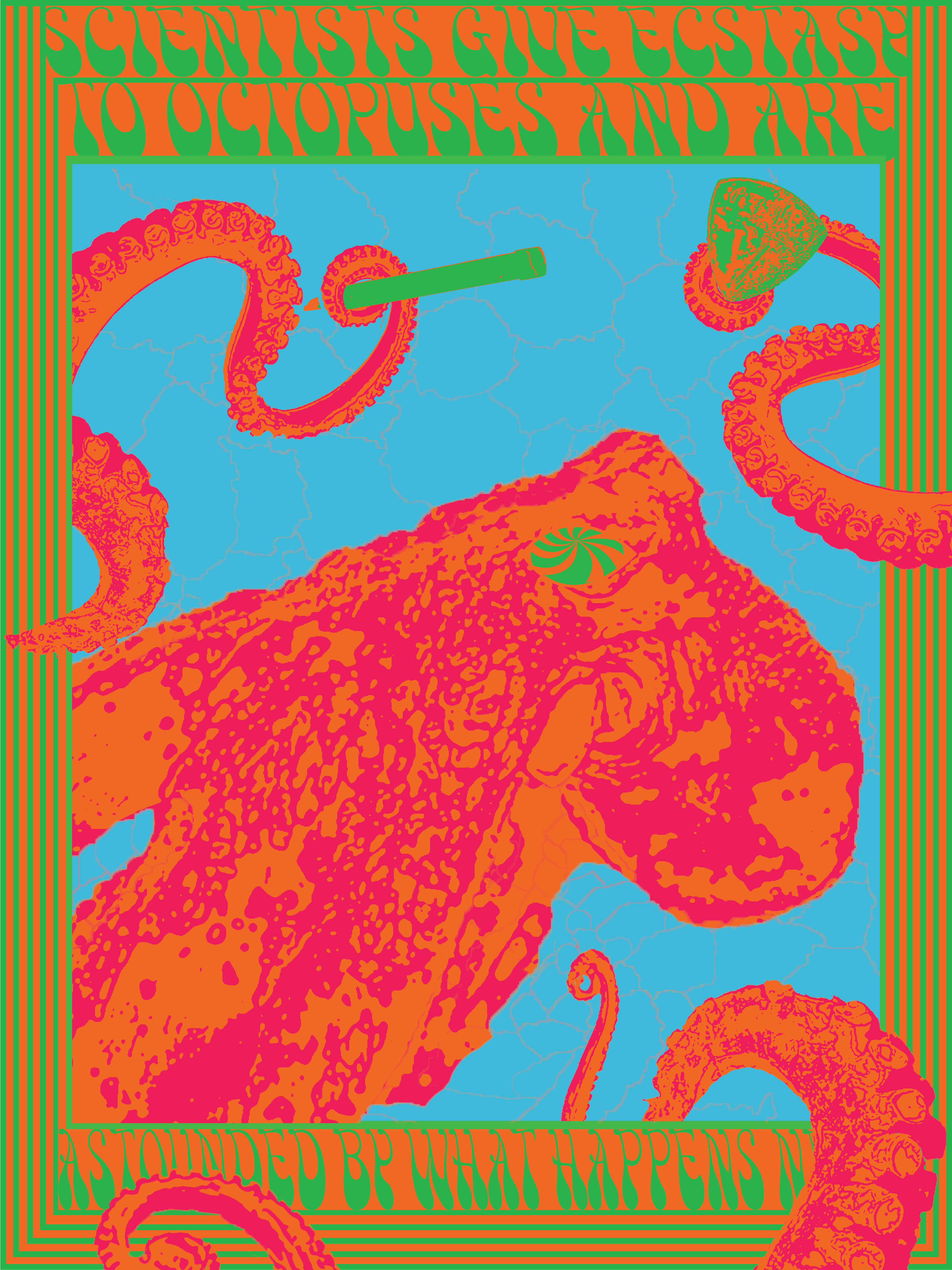
I started researching articles about drugs and other psychedelics of Moscoso’s time and found an article about ecstasy and Octopi. My final iteration, in the spirit of Moscoso had the tentacles grip the frame and obscure the text.
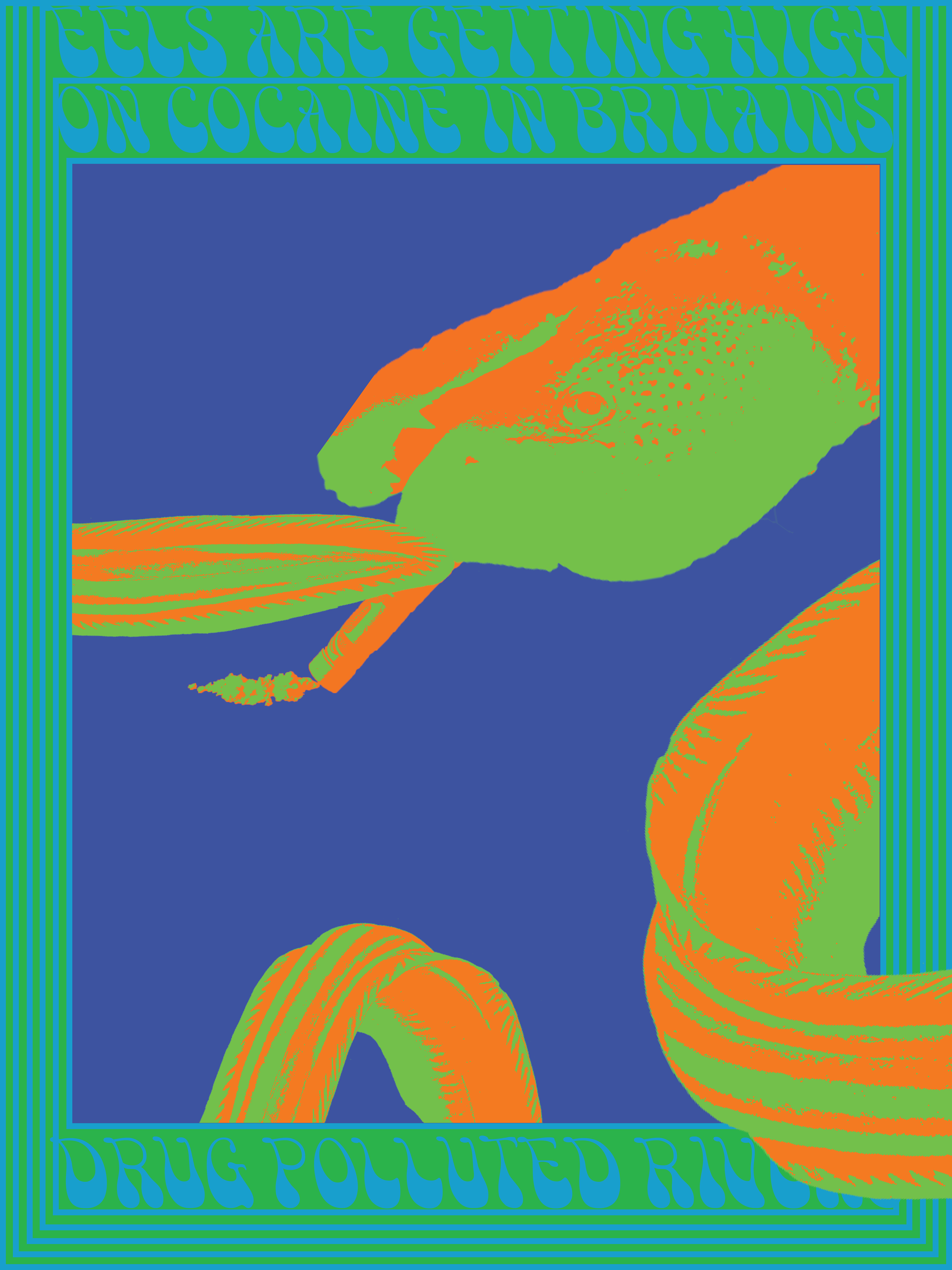
Two years after my initial design, I returned to the project to update it for my portfolio. It was not strong enough on its own, so I created two more posters to go with an updated original. I researched more sea creatures and pharmaceuticals and found an article about eels and cocaine.
I could have used a similar color palette, but I found it boring. I chose a lighter combination of blue and green that created a lighter version of the same vibrating effect. The final poster utilizes the same effect of breaking the foreground and background of the frame.
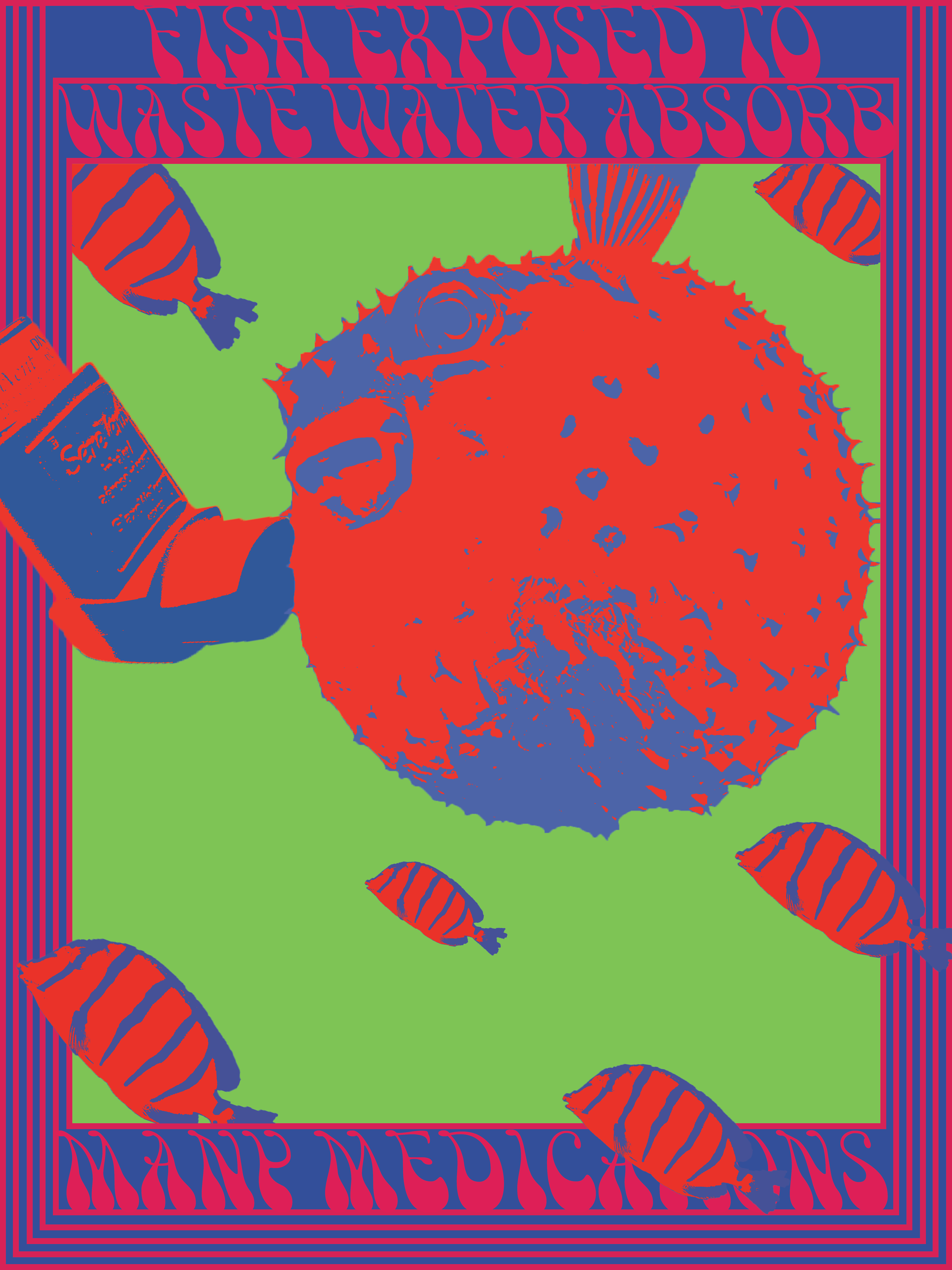
My last poster took more thought as I was struggling to think of creatures that possessed the same kind of qualities that allowed its body to wrap around and grip the frame. I decided to research more articles about sea life and pharmaceuticals and found an article about a variety of sea creatures and less recreational drugs.
The last poster was unlike the others as I relied upon a number of smaller fish to break the foreground and background rather than one singular creature. The article mentioned specifically inhaler medication and its effect on the aquatic ecosystem. I thought pufferfishes had a nice correlation.


